Client
Citizens Advice provides specialist and confidential information and advice to assist people with legal, debt, consumer, housing and other problems in the United Kingdom.
Audience
• Citizens Advice Advisers
• Partner organisations
• Charities
My role
• Product design
• User experience design
• User research
• User testing
• UI design
• Interaction design
• Stakeholder presentations
Context
When working as a Senior Product Designer at Citizens Advice, I led product design for two teams working in Agile methodologies. One product was ‘Casebook’, the internal case management Web Application used by their advisers across England and Wales to record clients’ cases and records. The other was the Referrals product - connected to Casebook.
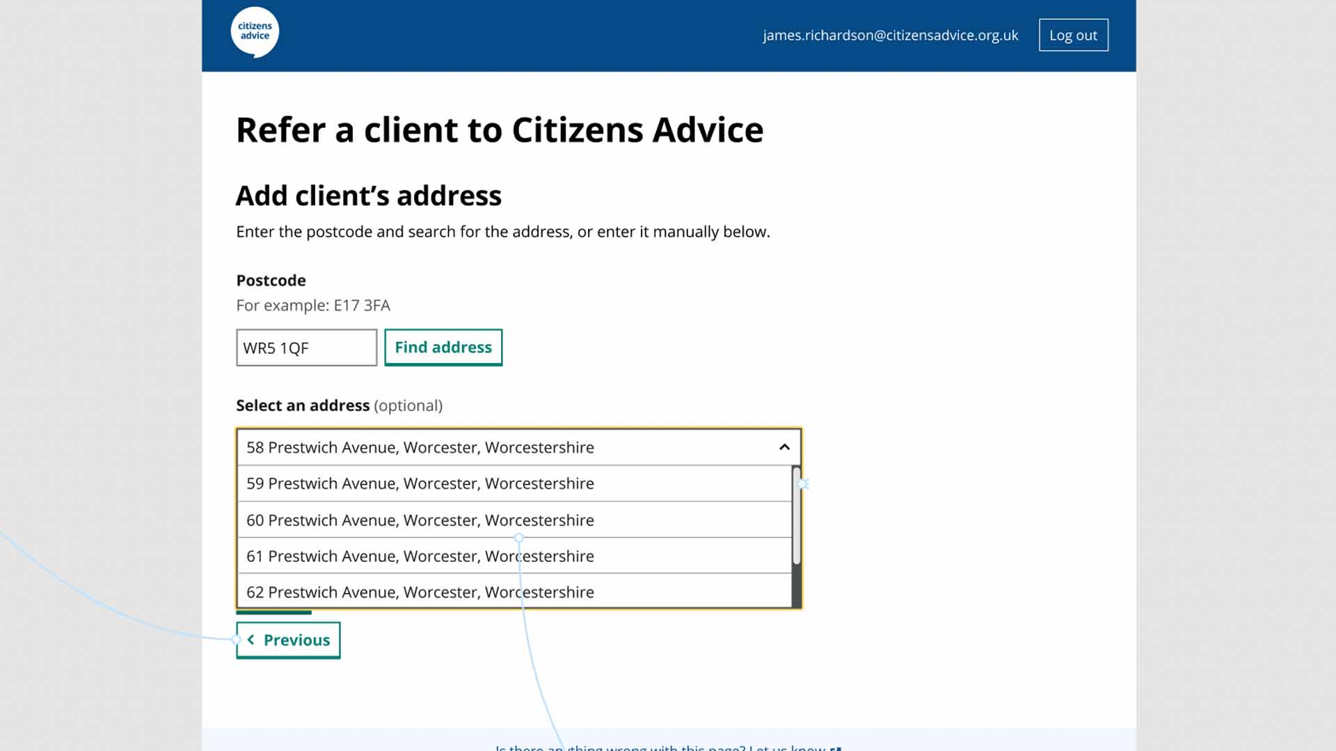
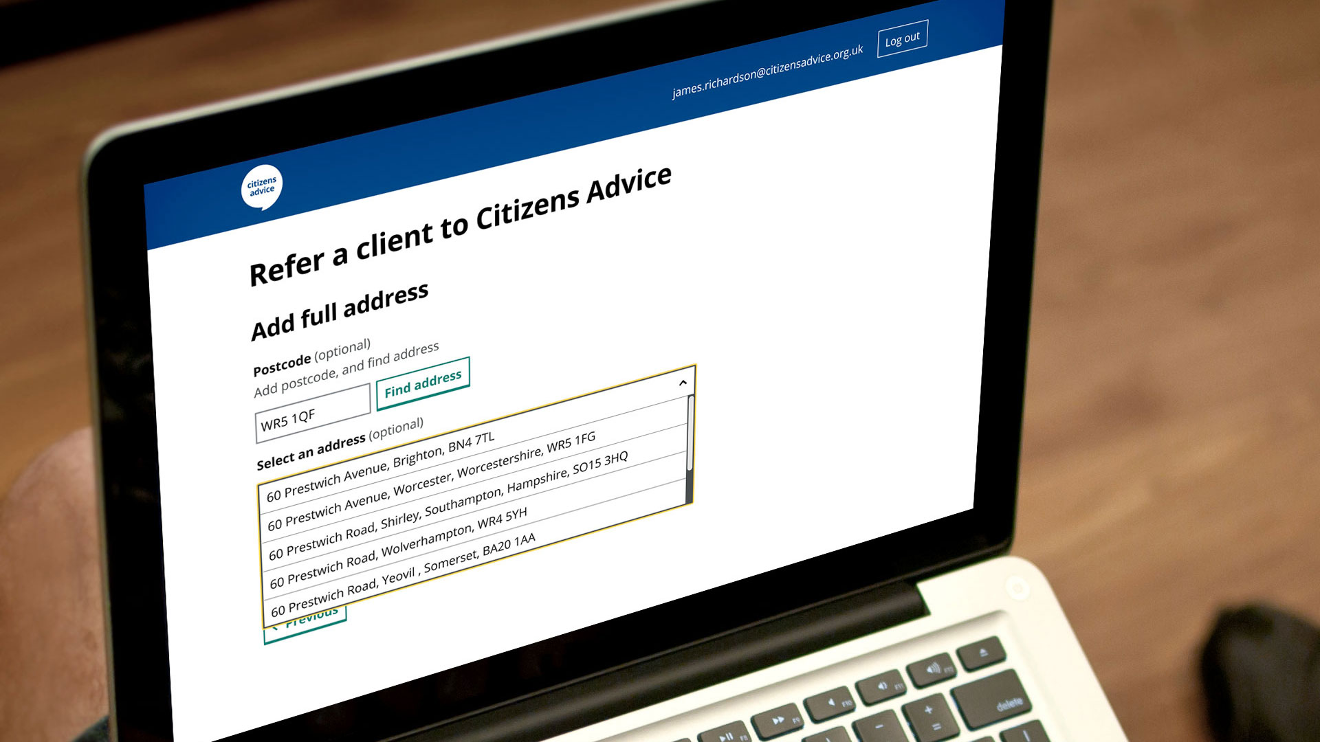
The Referrals product had been built as an MVP focusing on improving client referrals in, within, and out of Citizens Advice. We were reviewing recent user feedback and user testing results and identified we needed to add an address look-up feature to the product.
Approach
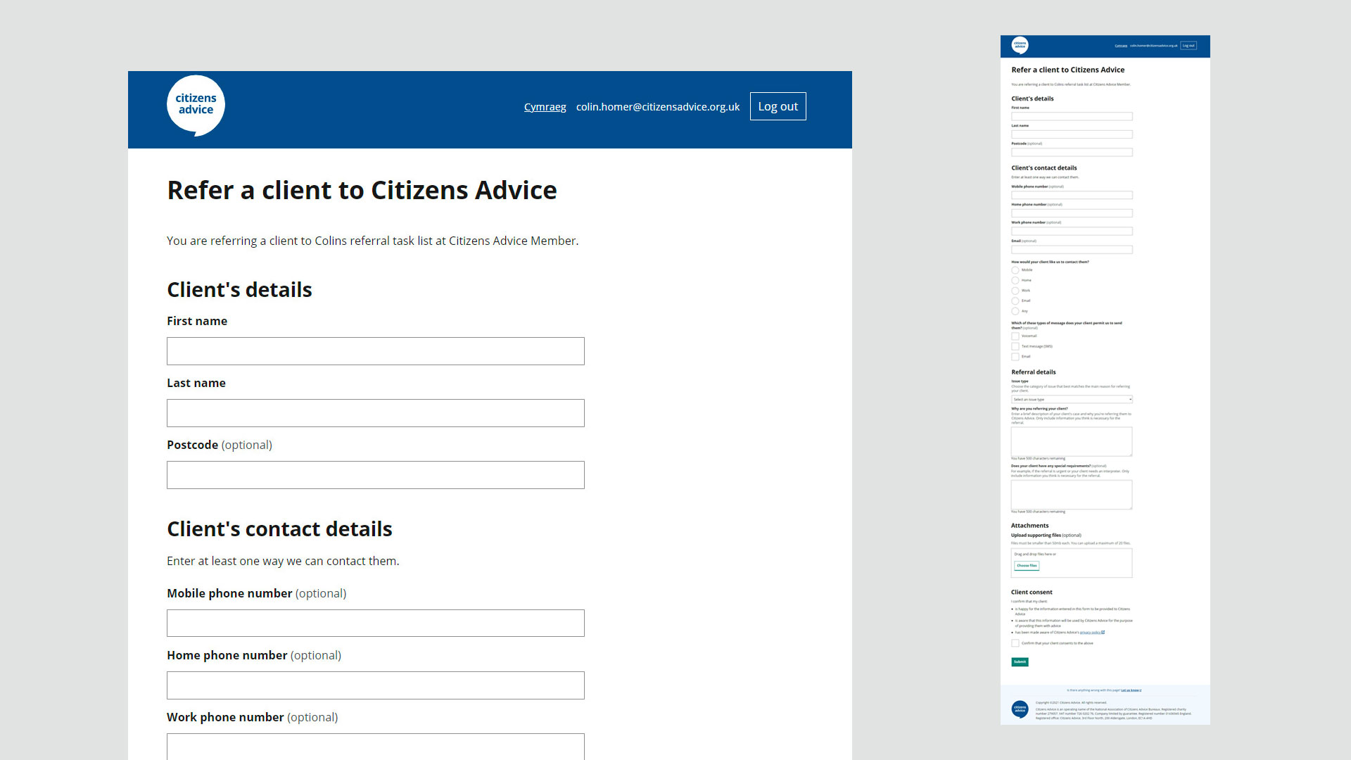
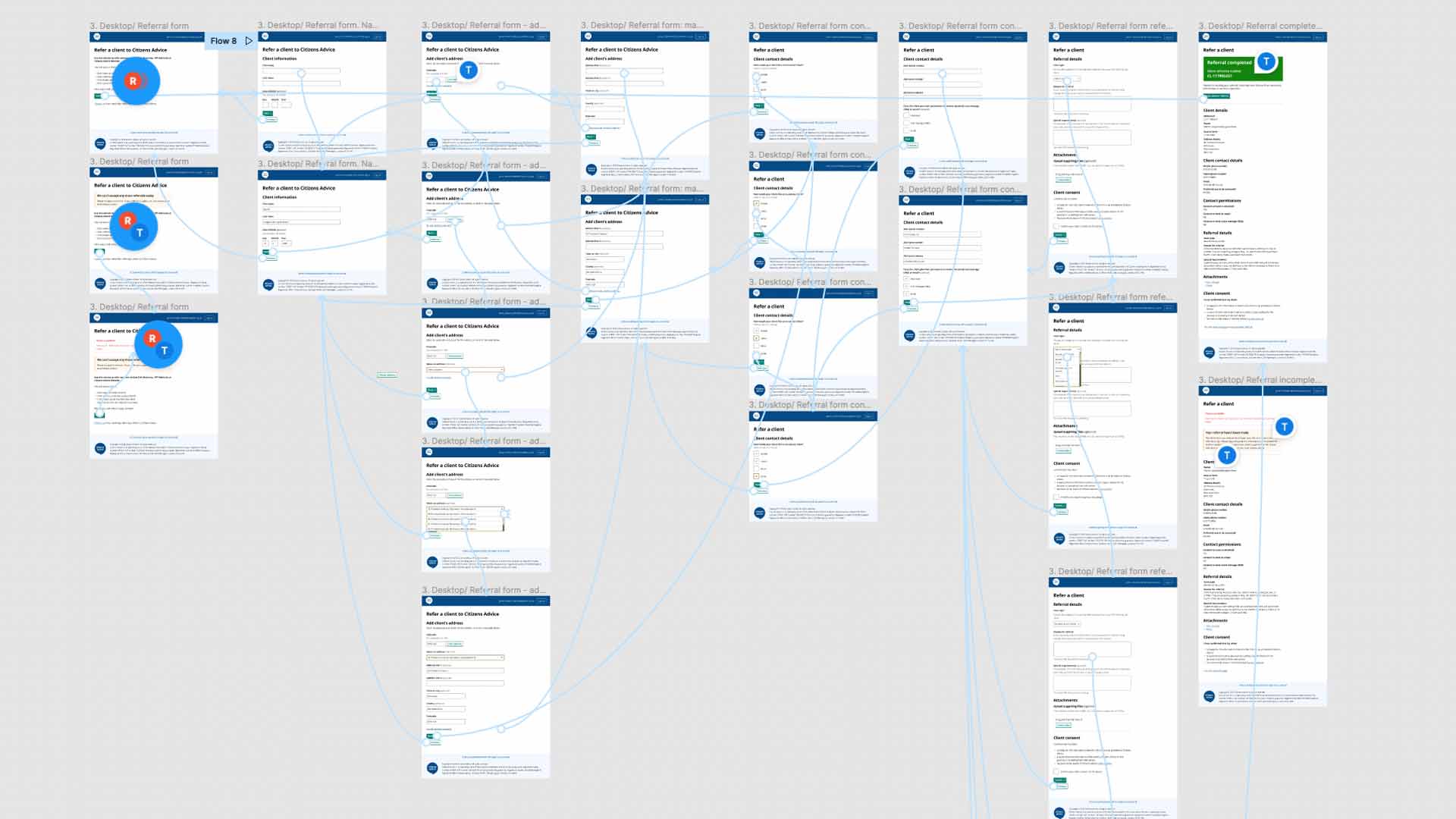
We decided to change the design of the inward referral journey by introducing multiple pages and branching to the inward form design - as opposed to the long scroll form design which was becoming difficult to use and maintain. This approach would reduce cognitive load for the end users, as it would use branching to gather only the relevant information the referral client needed to transfer. It would also improve accessibility as there would be less disclosures used on the form interactions.
Original MVP inward form prototype design
Revised prototype design using progressive disclosure
Address look-up component design

Some of the methods used in the Product Design cycle included:
DISCOVERY:
User interviews
- User surveys
- Stakeholder feedback
- Engineer feedback
Kick-off session with product manager to discuss challenge
Research - best accessible design patterns for adding address look-ups to forms including gov.uk and National lottery fund
DEFINE:
Introduce progressive disclosure into form, and the design system
Introduce branching for a better UX
DEVELOP:
Figma prototype interactions
Feedback loops with developers
Feedback loops with Product Manager
Demo at ‘show and tell’ with stakeholders
Research plan
User testing
Testing analysis
Opportunities
Iterations
DELIVER:
Refined designs
Re-engineering of tech stack to server-side rendering
Outcomes
User testing showed that this progressive disclosure design approach for inward referrals was an improvement to the users' journey and experience. As a result, new components were built by developers. There was also a re-engineering of the tech stack to server-side rendering for the Referrals product. The Design System community of practice were informed of the design pattern - to be used in future design - and the Referrals MVP has continued to evolve improving user experience and product feasibility.
Selected Works

User Interface DesignSave the Children

Website RedesignChange Grow Live

Contacts Mobile AppChange Grow Live

Website Blog DesignSightsavers

SpecsAppeal CampaignSightsavers
Annual ReviewSightsavers

Brand DevelopmentSightsavers
Brand RefreshChange Grow Live
Want to know more?
Send me an email at:
tom@tommortondesign.com
© Tom Morton 2025