Client
Save the Children UK raises money to improve children's lives by creating better educational opportunities, better health care, and improved economic opportunities. It achieves this through several methods, including health, education, and protection programs.
My role
• Product design
• User experience design
• User research
• User Interface design
• Interaction design
• Stakeholder presentations
Context
After conducting a heuristic evaluation on the Save the Children’s website and donation platform, as well as reviewing Decibel Insights recordings of real users interacting with our website, and exploring best practices for accessible UI design, we found an opportunity to enhance the UI design. This improvement would lead to a better user experience by enhancing accessibility, usability, and reducing friction for our end users.
Approach
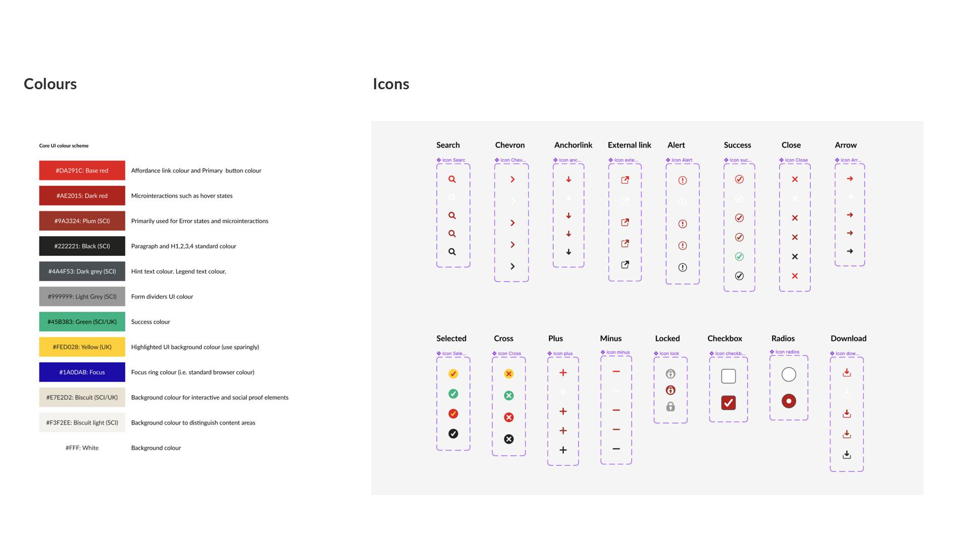
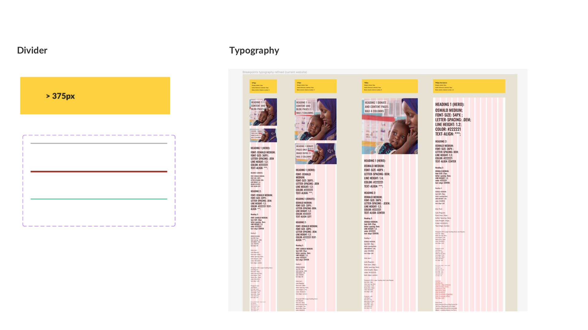
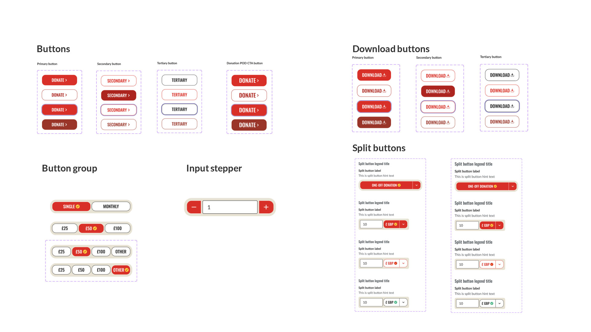
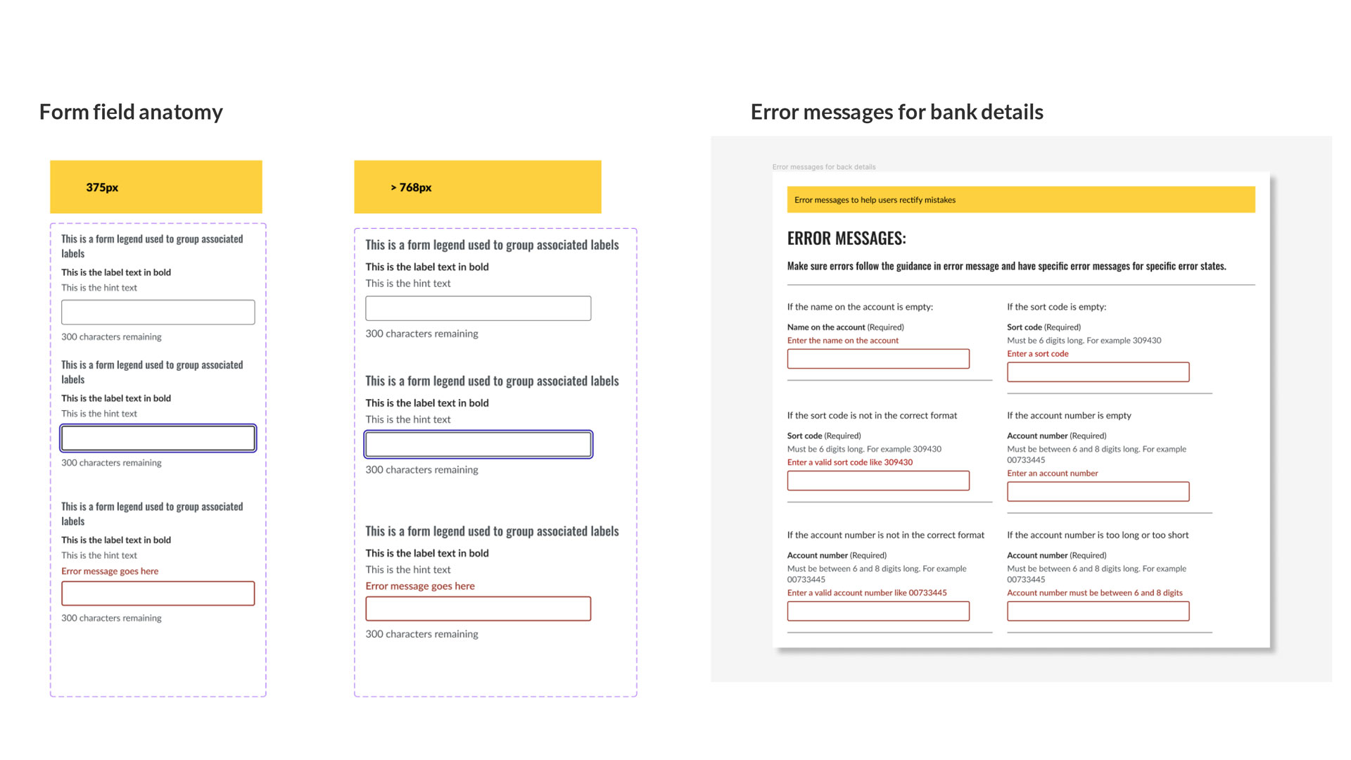
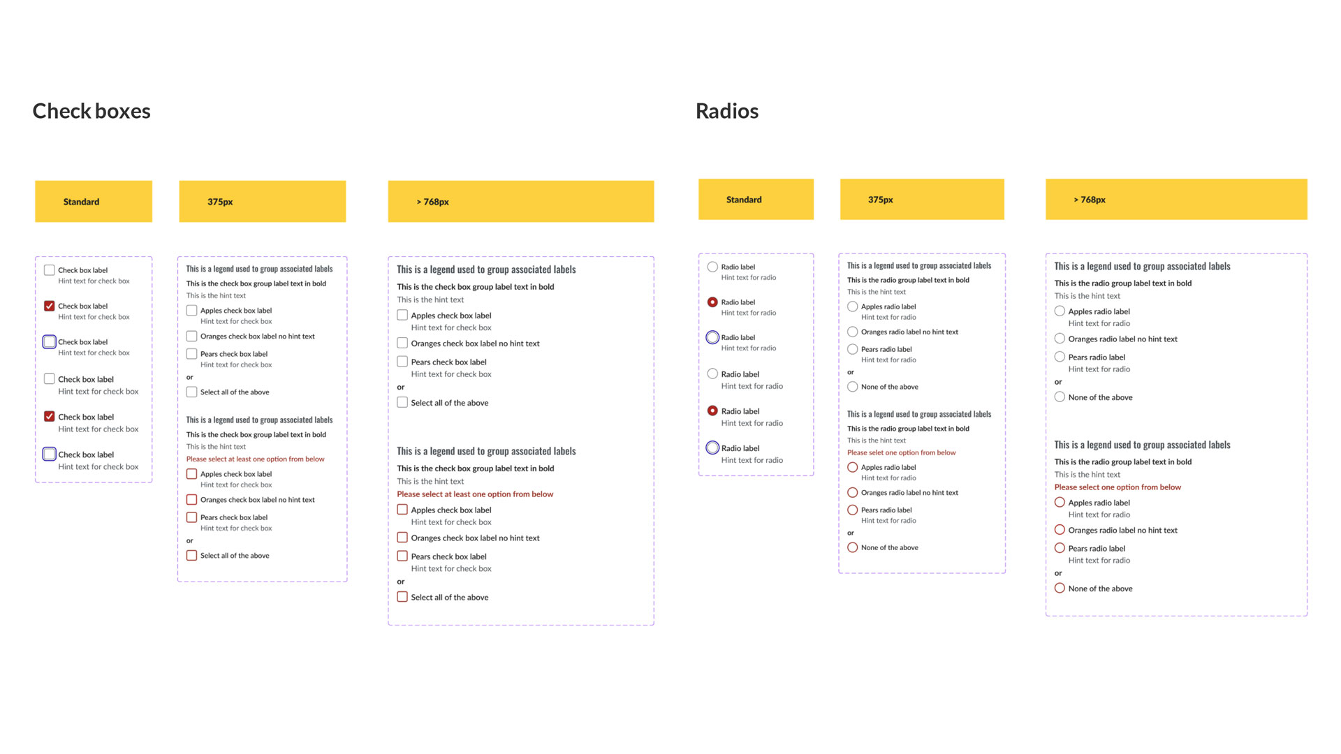
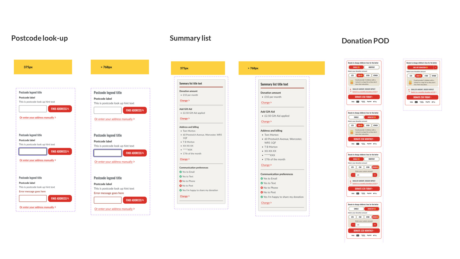
To enhance the user interface design of the website, I adopted an Atomic design approach. This involved refining the Atoms, such as the colour palette to boost accessibility by enhancing contrast levels for various colour combinations. Additionally, I introduced a consistent affordance colour and prompt elements/icons. The typography was also adjusted to enhance accessibility and readability. I then developed Molecules, including buttons, split buttons, button groups, radios, check boxes, and other form elements, specifying interaction states including focus states for keyboard users. These Molecules were then used to form components like our donation widget. The overall goal of these UI designs is to enhance accessibility, usability, and consistency across the website product, which in turn improves the user experience and also brand trust with supporters.
Atoms: colours and icons
Atoms: Dividers and Typography
Molecules: various buttons and their interaction states
Components: form field components and interaction states
Components: check boxes and radio buttons and their interaction states
Components: postcode look-up, summary list and donation module

Outcome
I worked closely with the product manager and web developers to add epics and stories to the product backlog, aiming to deliver designs in staging for user testing and refinements before live release.
Selected Works

Referrals Product DesignCitizens Advice

Website RedesignChange Grow Live

Contacts Mobile AppChange Grow Live

Website Blog DesignSightsavers

SpecsAppeal CampaignSightsavers
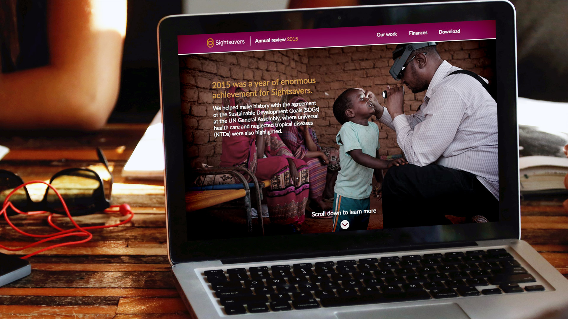
Annual ReviewSightsavers

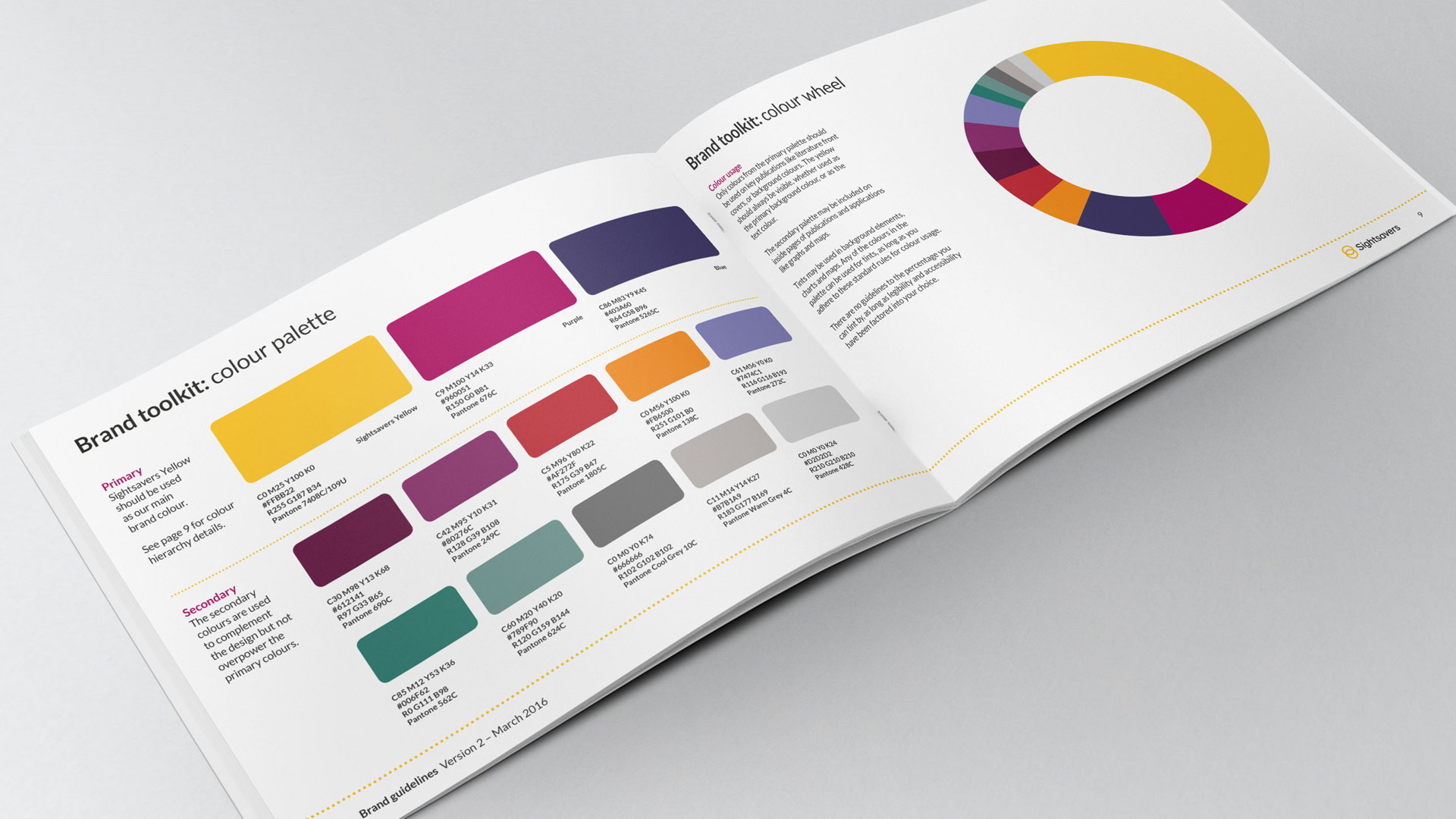
Brand DevelopmentSightsavers
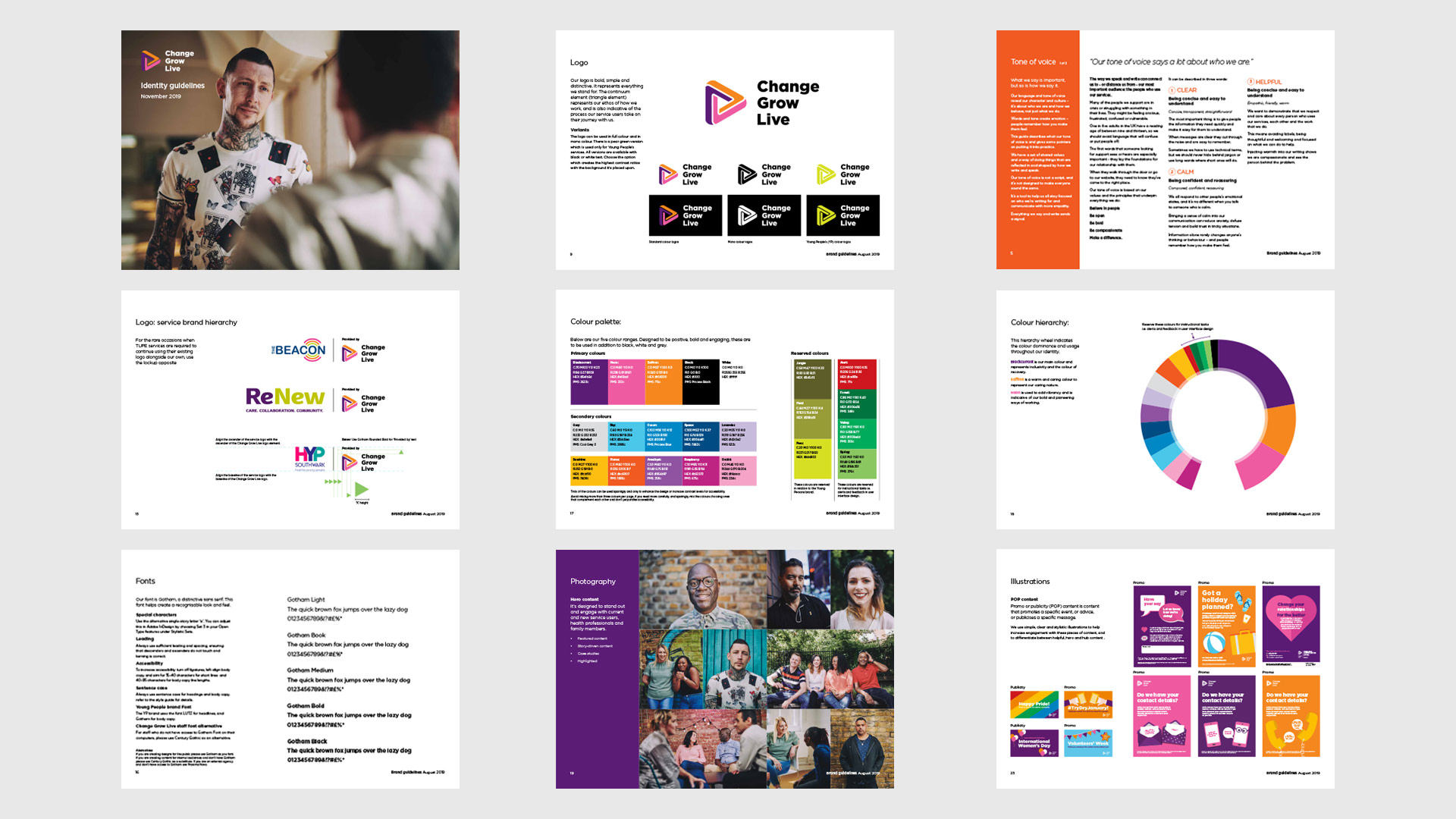
Brand RefreshChange Grow Live
Want to know more?
Send me an email at:
tom@tommortondesign.com
© Tom Morton 2025